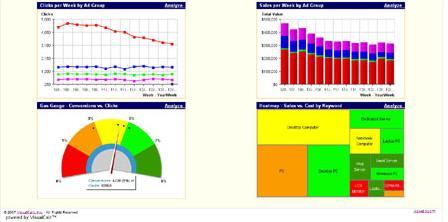
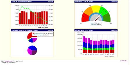
The VisualCalc AdWords Dashboard is a web-based solution that can improve the performance of your Google AdWords and other PPC (pay-per-click) campaigns. It can transform your complex PPC data into interactive, easy-to-interpret graphs and charts.

The Dashboard turns raw AdWords/PPC data into graphical performance indicators, such as clicks vs. impressions, conversions by ad group, click through rate by keyword, etc. Its makers say that indicators can be created for almost any combination of Google AdWords or PPC data. Furthermore, these indicators are expressed by a variety of graph formats of your choice, including bar charts, pie charts, line graphs, gauges and heat maps.

It can help you by providing visual answers to key AdWords questions, such as:
“Which campaigns, ad groups and keywords are delivering the best return on investment (ROI)?†or “How are key measurements such as impressions, clicks and conversions trending over time?†and more.
We are currently doing an in-depth review of VisualCalc and will have the review posted shortly.


