

There’s no such thing as perfect. No matter how well-written or well-made something is, there’s always room for improvement. That includes calls to action featured in your ads, on your website, and in your blog posts. With that in mind, here are some of the best CTAs we’ve ever seen, and what makes them awesome.
The call to action (CTA) is one of the most foundational and crucial aspects of marketing. It’s the final step of your marketing strategy, the means by which a prospect is ultimately converted into a lead. Small wonder some businesses spend years chasing the perfect CTA.
Most never even come close.
That’s not just because perfection doesn’t exist and designing CTAs is an involved and ongoing process, one which requires an extensive understanding of your audience. It’s because many businesses are either afraid to get creative with their CTAs or don’t really understand what they can do.
I’d like to talk about that today. We’ll start with what makes a CTA successful before moving on to list some of the best I’ve seen. A good call to action:
- Is designed with a clear goal in mind. That could be increasing sales, driving subscriptions to a mailing list, or spurring readers to consume more content on your site.
- Is simple and concise. Your call to action shouldn’t be more than a few words long. Keep it short, sweet, and impactful.
- Uses words that indicate your desired course of action. “Click here” is a weak call to action. Instead, consider one of the examples from this list by marketing agency Wishpond.
- Understands its audience. The best CTAs are highly-targeted. They’re written with an understanding of who the audience is, how they communicate, and what they’re looking for.
- Ties everything together. You can’t have a good CTA without good content. Your CTA is sort of like the ribbon on a gift box. That box can’t be empty – there needs to be something to it.
- Doesn’t deceive the audience. Consumers value authenticity above all. In a 2017 study, for example, publication Social Media Today found that 90 percent of millennials say authenticity is important to them when deciding what brand to support. And if you’re a B2B brand, being transparent about your products and services is even more important; it is, notes the B2B Marketing Blog, table stakes.
1. Crazy Egg (Landing Page)

Web optimization specialist Crazy Egg doesn’t just understand what makes a good website. They’ve got the elements of a great call to action totally locked down. The image above is captured from their site’s main landing page.
It’s simple, it’s compelling, and it establishes that Crazy Egg’s product is completely risk-free. Moreover, it directly addresses its audience with an understanding of their core reason for using Crazy Egg’s services. It even offers an alternative for people who might be a bit hesitant to commit – the opportunity to learn more about the business and what it does.
2. Animoto (Facebook Ad)
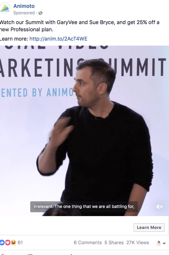
Source: https://adespresso.com/blog/call-to-action-examples
People don’t usually pay a lot of attention to Facebook ads and sponsored posts. At most, they might briefly glance at their sidebar or pause for a moment as they scroll. That means that these ads need to get their message across immediately. They need to be as concise as possible and grab your attention without being obnoxious.
The advertisement created by Animoto, which develops and maintains a cloud-based multimedia tool, was created with an understanding of the above. It gets right to the point and tells people exactly why they should watch Animoto’s summit. No needless fluff, and no over-the-top language.
Transparent, direct, and effective.
3. Netflix (Landing Page/App)
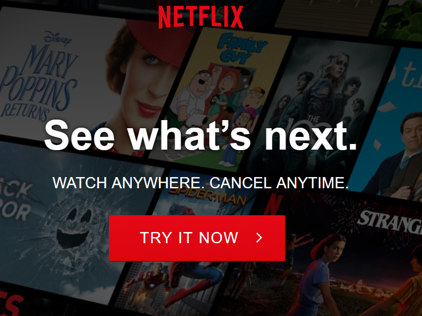
If there’s one thing Netflix understands, it’s how to design an effective CTA. Above is the first thing a new visitor sees when opening the app or visiting the website. Simple and yet visually appealing, it does a ton of things right.
First, the background shows some of the service’s most popular shows. Series like Black Mirror, The Office, and Stranger Things are positioned front-and-center. After all, even people who don’t have a Netflix account have probably at least heard of them – likely as not, that’s why they’re here in the first place.
Second, the page emphasizes that using Netflix is risk-free and convenient. It can be watched from anywhere. And if a user tries the service and doesn’t like it, they can cancel as they see fit.
Lastly, it guides the user forward with strong language. See what’s next. Because we both know that when you use Netflix, you binge it – it’s something you can’t get enough of.
4. EPIC (Landing Page)

My next example is intended to drive home the importance of content to your CTA. It also serves as a framework for how you can work multiple CTAs into a single, uninterrupted content set. Belgian Marketing Agency EPIC’s website is easy to navigate, it’s aesthetically pleasing, and it gently guides the user along each stage of their journey.
It starts with a black screen and a scroll icon. Next is a two-sentence description of the agency and what they do and a catalog of major projects followed by a client list. Finally, it concludes with the image above – prospects can either contact the brand, subscribe to its marketing newsletter, or immediately dive in as a client.
5. Neil Patel (Blog)
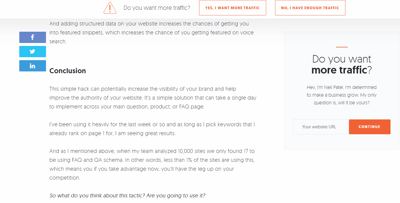
Neil Patel is a well-known personality in the world of digital marketing. It stands to reason that his website would feature some pretty compelling calls to action. His blog is no exception to that.
The above image features several CTAs. The bar on the top, which follows the user as they scroll, asks a question most people aren’t likely to say no to – but they have the option to close it if they want. The sidebar, meanwhile, directly addresses the reader in friendly, authentic language.
There’s also the social sharing buttons at the side and bottom of the article, and the last line of the post, which directs a question at the audience intended to foster conversation. There’s a lesson in that. Not every CTA needs to be sales-oriented.
Generating buzz and inspiring conversations can be just as powerful.
Conclusion
The perfect call to action doesn’t exist. Your CTAs can always be improved in some way. The examples above should serve as good guidelines for what makes a CTA compelling – good frameworks for designing your own.


