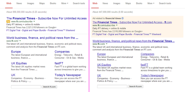
Google is exploring new ideas to make the search page layout look more simple and easily accessible to its users. As a part of the trial method, this time the search engine is introducing a myriad of changes to the search results page. No doubt, the modifications will make Google look neat and clutter-free.
One of the most significant changes is the removal of the underlines from all the links that appear in the search results. The change is applied to both paid and organic content. Apart from this, searchers can now see a new font style and larger font size for the titles. As a result of the up-gradation, less characters appear on the hyper-links in the new layout. This means you have to reconsider your title tag soon to ensure that it fits in perfectly and accommodates in the new design. The change was first tracked down by Dan Barker.
 Image Credits: Dan Barker
Google is also turning to a gray text color rather than the previous black tone. However, users are complaining that the new color is comparatively harder to read. Moving a step ahead in its experiments with advertisements which started last year, Google is now running tests to make the AdWords search results appear more like ads. As a part of the experiment, Google has colored the “Ad” label in bright yellow and the word “Ad” in white. The “Ad” label will appear besides each ad above the organic results, and the word "Ads" above the paid search ads that pop up on the side.
It seems Google has amplified the velocity of the tests, as more and more searchers are posting about seeing these updates on Twitter, Facebook and other platforms.
Related Stories:


